
Page 14 - CIWA Brand Toolki 2025
P. 14
Brand Toolkit Cooperation in International Waters in Africa 2025
Color system
Primary colors
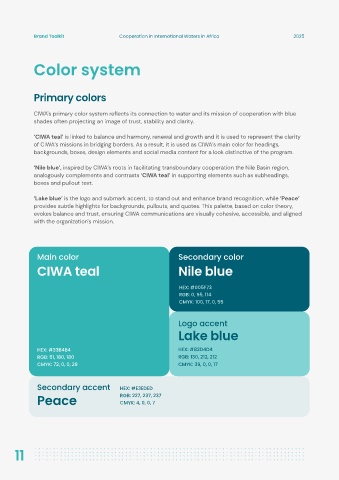
CIWA's primary color system reflects its connection to water and its mission of cooperation with blue
shades often projecting an image of trust, stability and clarity.
‘CIWA teal’ is linked to balance and harmony, renewal and growth and it is used to represent the clarity
of CIWA’s missions in bridging borders. As a result, it is used as CIWA’s main color for headings,
backgrounds, boxes, design elements and social media content for a look distinctive of the program.
‘Nile blue’, inspired by CIWA’s roots in facilitating transboundary cooperation the Nile Basin region,
analogously complements and contrasts ‘CIWA teal’ in supporting elements such as subheadings,
boxes and pullout text.
‘Lake blue’ is the logo and submark accent, to stand out and enhance brand recognition, while ‘Peace’
provides subtle highlights for backgrounds, pullouts, and quotes. This palette, based on color theory,
evokes balance and trust, ensuring CIWA communications are visually cohesive, accessible, and aligned
with the organization's mission.
Main color Secondary color
CIWA teal Nile blue
HEX: #005F73
RGB: 0, 95, 114
CMYK: 100, 17, 0, 55
Logo accent
Lake blue
HEX: #33B4B4 HEX: #82D4D4
RGB: 51, 180, 180 RGB: 130, 212, 212
CMYK: 72, 0, 0, 29 CMYK: 39, 0, 0, 17
Secondary accent HEX: #E3EDED
Peace RGB: 227, 237, 237
CMYK: 4, 0, 0, 7
11