
Page 12 - CIWA Brand Toolki 2025
P. 12
Brand Toolkit Cooperation in International Waters in Africa 2025
Logo use / misuse
Do’s
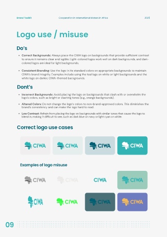
Correct Backgrounds: Always place the CIWA logo on backgrounds that provide sufficient contrast
to ensure it remains clear and legible. Light-colored logos work well on dark backgrounds, and dark-
colored logos are ideal for light backgrounds.
Consistent Branding: Use the logo in its standard colors on appropriate backgrounds to maintain
CIWA’s brand integrity. Examples include using the teal logo on white or light backgrounds and the
white logo on darker, CIWA-themed backgrounds.
Dont’s
Incorrect Backgrounds: Avoid placing the logo on backgrounds that clash with or overwhelm the
logo’s colors, such as bright or clashing tones (e.g., orange backgrounds).
Altered Colors: Do not change the logo’s colors to non-brand-approved colors. This diminishes the
brand's consistency and can make the logo hard to read.
Low Contrast: Refrain from placing the logo on backgrounds with similar tones that cause the logo to
blend in, making it difficult to see, such as dark blue on navy or light cyan on white.
Correct logo use cases
Examples of logo misuse
09